Patrimonio: a collection of Italian Excellence
Following a competitive pitch, Antiorario was selected by METRO Italia to create the identity for Patrimonio: a new project dedicated to a curated selection of food and beverage specialties rooted in territory, tradition and craftsmanship. From naming to visual identity, we developed a complete system designed to translate the value of food heritage into a distinctive, contemporary and premium language.
METRO ITALIA
INDUSTRY
SERVICES
STRATEGY, CREATIVITY, CONCEPT DEVELOPMENT
MEDIA
The challenge:
Giving a contemporary identity to heritage
The challenge was to build an identity capable of celebrating the cultural value behind each product without relying on the usual codes of tradition. Patrimonio needed to feel authoritative yet contemporary, premium yet accessible with an identity able to bring together different product categories and territories under one recognizable idea. Our starting point was the concept of heritage itself: something that is preserved, passed on and given new relevance over time.
Naming & identity.
Patrimonio: a name that holds the whole idea.
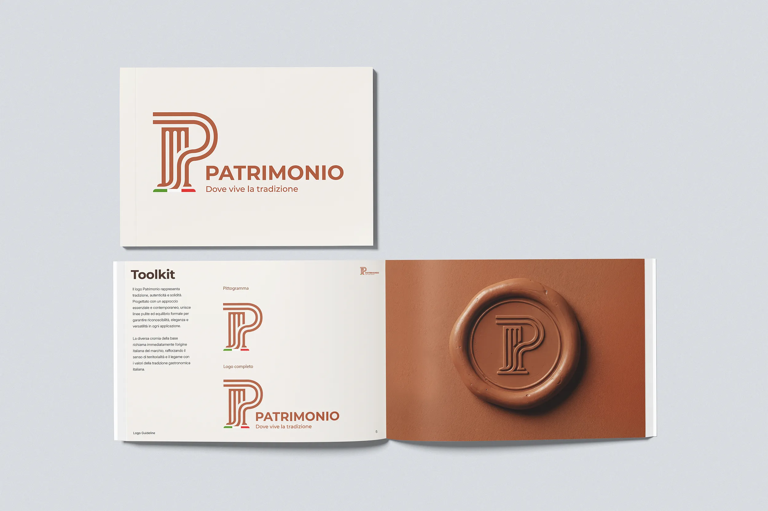
PATRIMONIO became the foundation of the project: a name that expresses a shared legacy of territories, traditions, craftsmanship and food culture. The visual identity brings two expressions of Italian heritage together: its gastronomic culture and its cultural legacy.
Inspired by classical architectural forms, the distinctive “P” becomes the meeting point between the two, translating the idea of PATRIMONIO into a contemporary and recognizable mark.
A symbol where gastronomic and cultural heritage meet.
The P as a Signature of Quality.
Beyond the logo, the “P” becomes a distinctive signature of quality. Transformed into a tactile, emblem-like element, it can take on different materials, textures and expressions while remaining instantly recognizable. Designed as a flexible mark device, the emblem can evolve across countless applications, from packaging and print to retail and digital, creating a consistent mark of recognition throughout the Patrimonio world.
More than a graphic element, it acts as a signature: a mark that identifies, endorses and celebrates the quality behind every Patrimonio selection.
Visual concept. Food as a work of art.
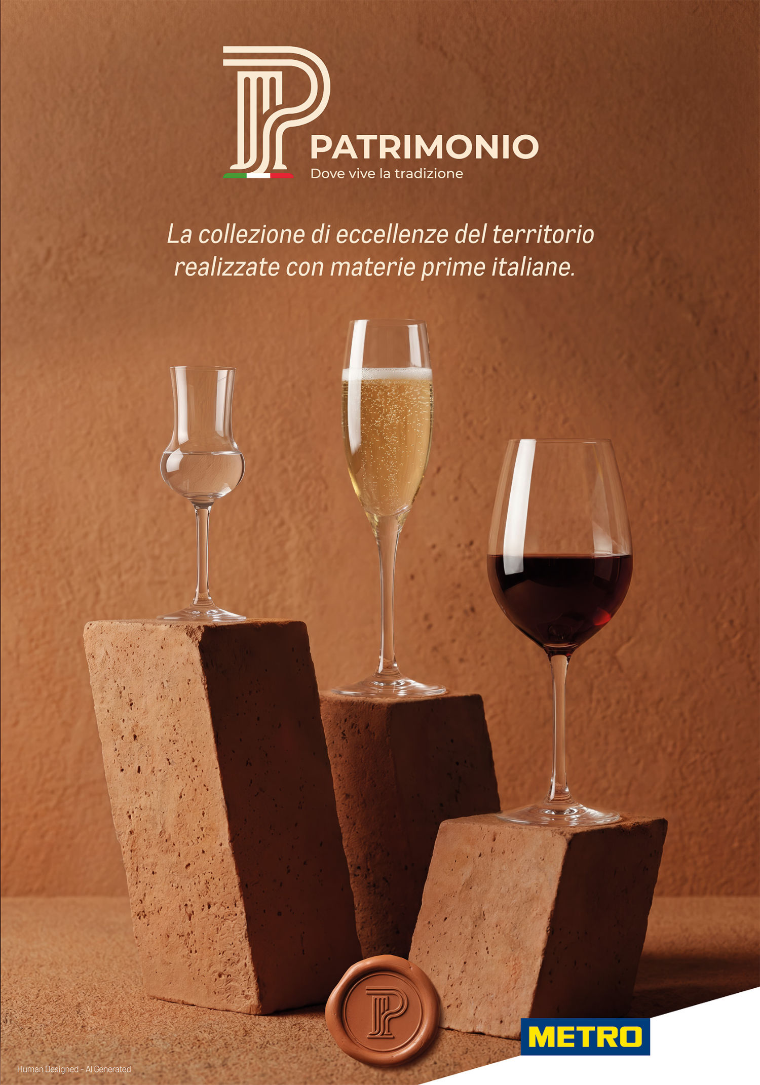
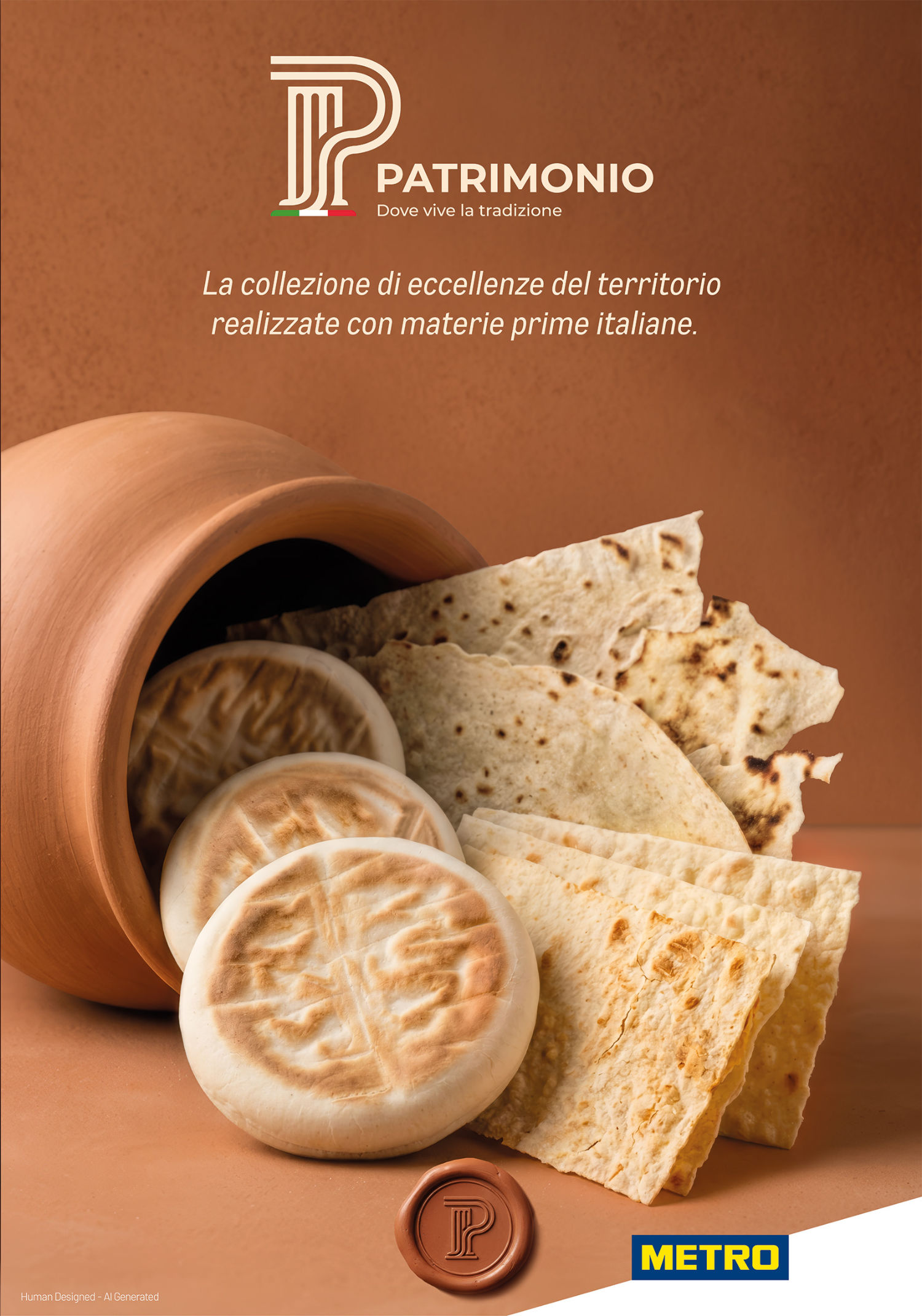
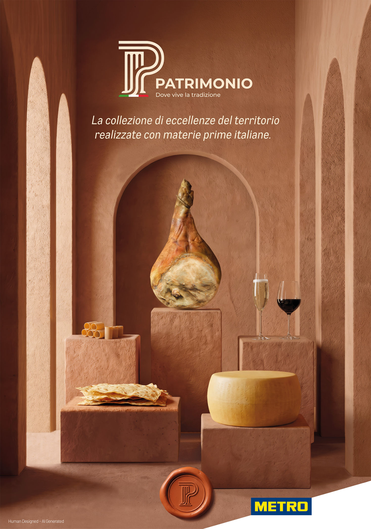
The campaign extends the identity into a visual world where food heritage meets artistic heritage. Products become protagonists of carefully composed still lifes, interacting with architectural and artistic archetypes: from columns and arches to sculpture, frames and other museum-inspired elements. Rather than simply displaying products, the imagery elevates them: each specialty is treated as an object of cultural value, something to contemplate, discover and preserve. We treated food not simply as a product, but as part of a cultural heritage.

A system across categories. One identity, many expressions.
Creative Strategy
Target audience understandingCreative strategy
Creative direction
Declinations study
Visual identity
CopywritingKey visual study
Brand ID
Logo Design
Final images
Toolkit
Elevating tradition.
Framing excellence.
A timeless gesture.
A portrait of Italian food culture.
A composition of craftmanship.
Elevating tradition.
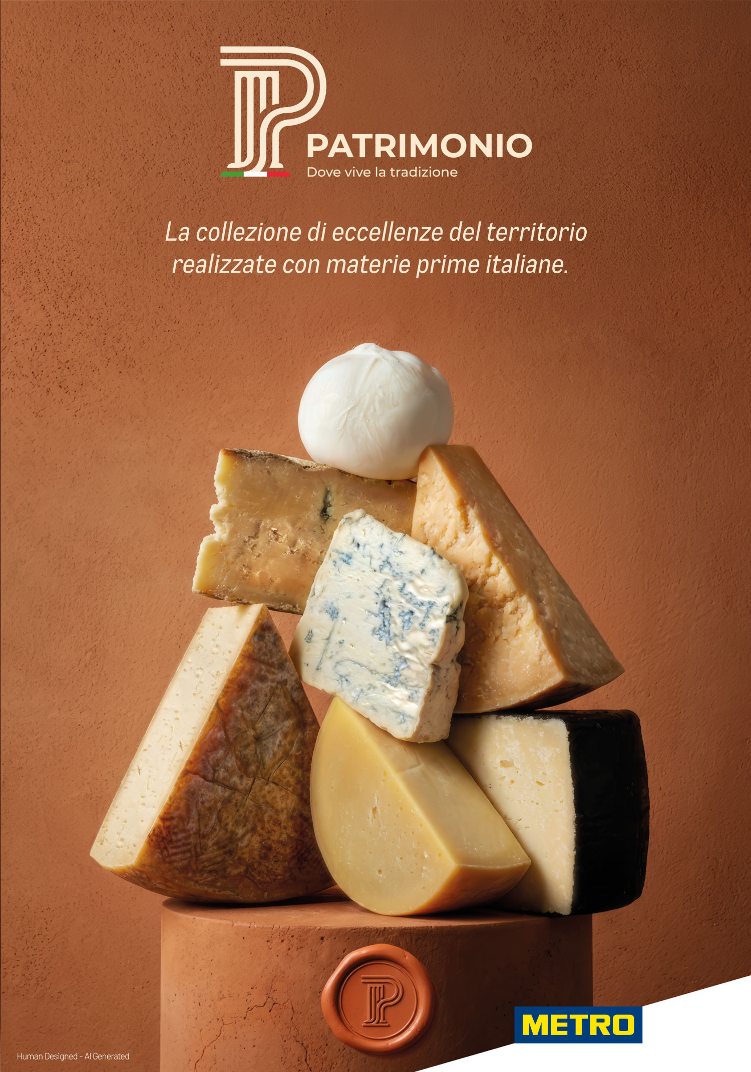
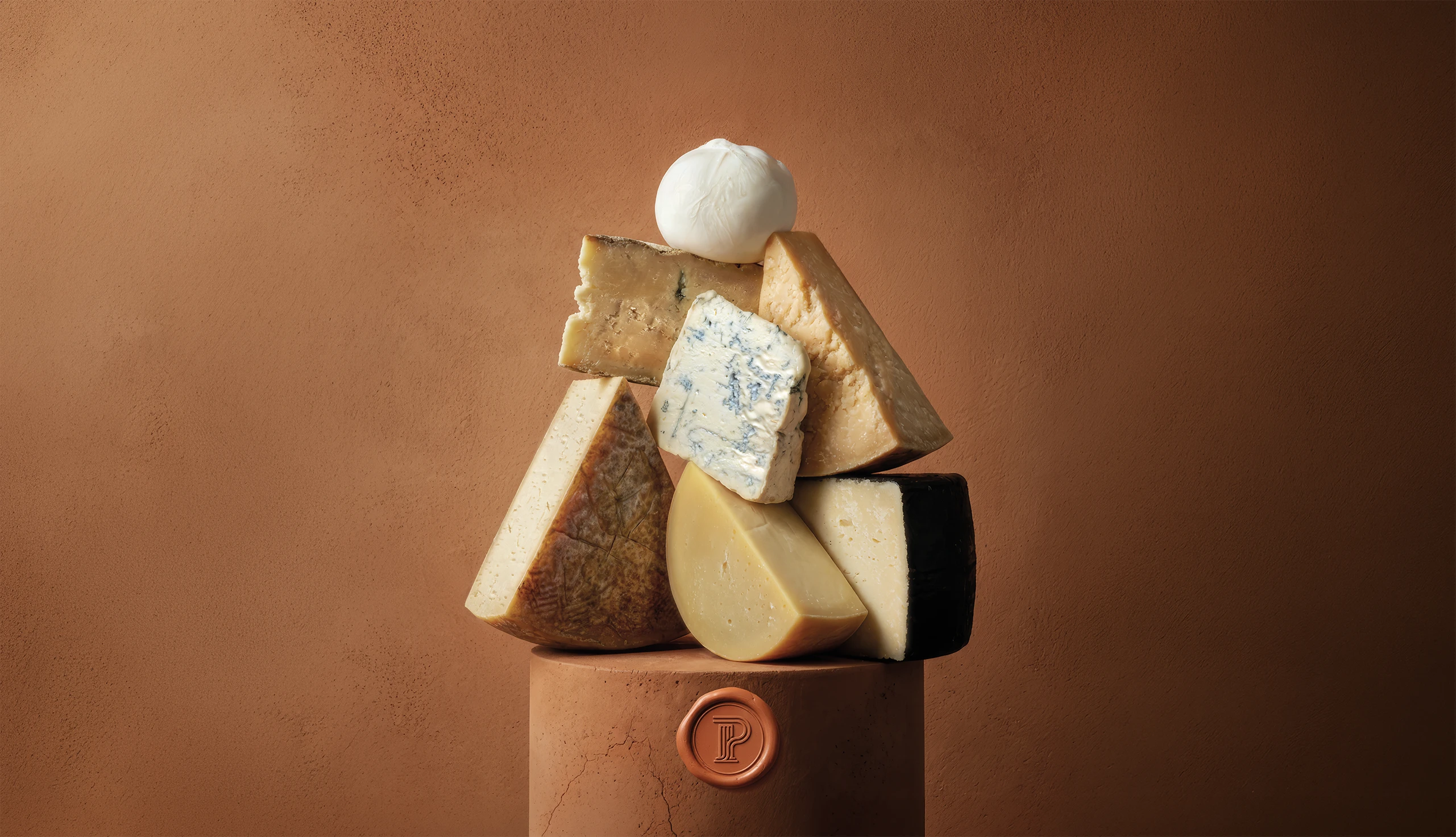
Cheese takes centre stage on a classical pedestal, transforming the product into something to be admired. A visual celebration of craftsmanship, provenance and the value of traditions passed down through generations.
Framing excellence.
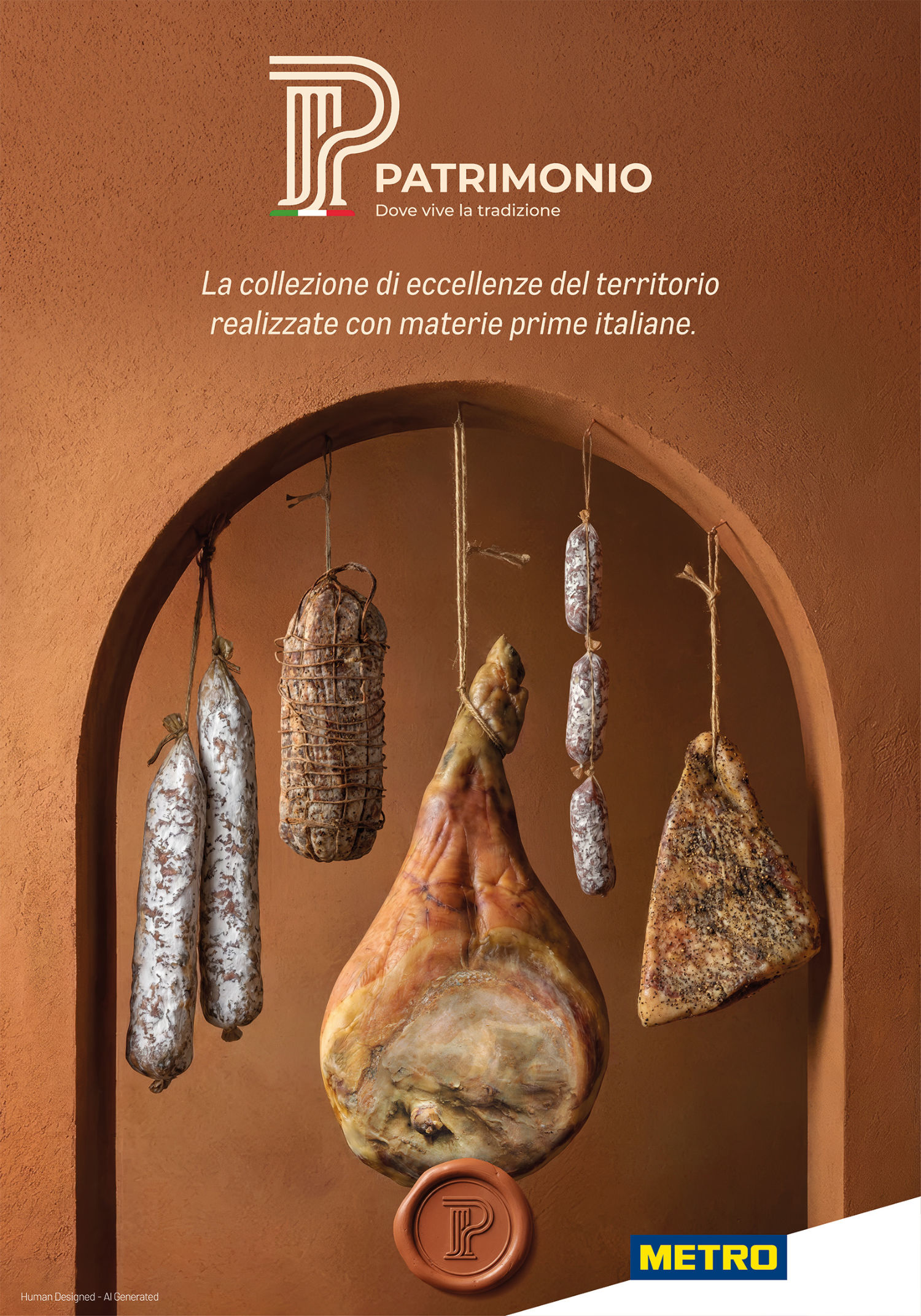
An architectural arch becomes a frame for Italian cured meats, turning a familiar product category into a composition that evokes history, territory and the enduring beauty of Italian heritage.
A timeless gesture.
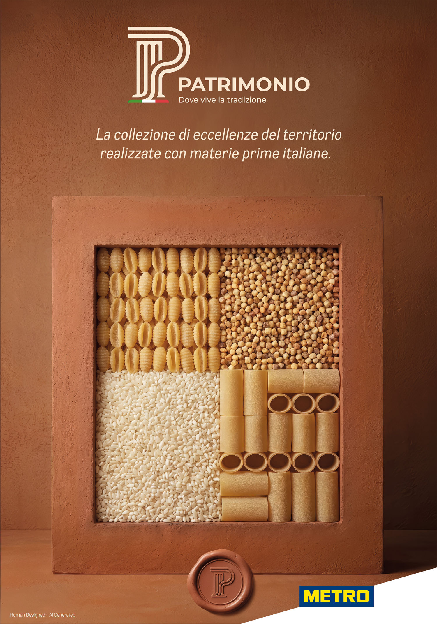
A portrait of Italian food culture.
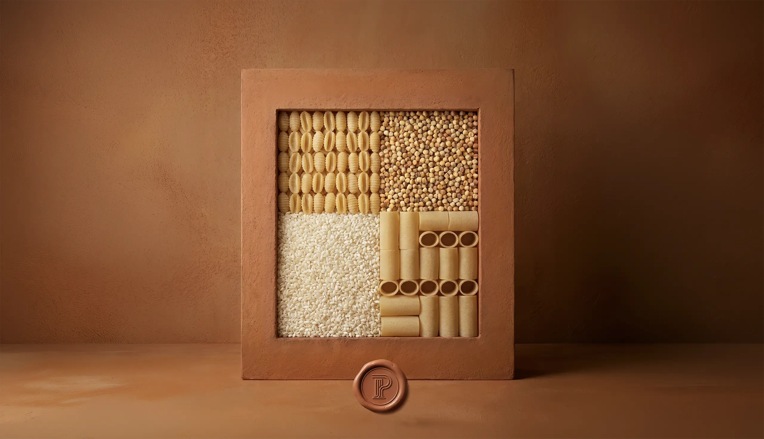
Pasta and rice become the subject of an artwork, composed within a painterly frame. Everyday ingredients are reinterpreted as icons of a food culture shaped by territories, traditions and generations.
A composition of craftmanship.
A collection of Italian excellence.
Designed to live everywhere.
Patrimonio was conceived from the outset as an identity able to move seamlessly across multiple touchpoints.
We developed the system from its core assets — naming, logo and visual language — through campaign key visuals and category-specific executions, all the way to in-store communication, digital applications and catalogue materials. The result is a coherent identity that can shift in scale and format without losing its recognisability: from a single graphic element to a complete retail environment.
Patrimonio transforms the richness of territory, tradition and food culture into a contemporary experience — giving METRO a distinctive platform through which to select, celebrate and communicate its food and beverage excellence.